Designing Prepaid with AI.
What AI-assisted design taught us shipping iKhokha’s Prepaid feature — and where we take it next.
Big feature. Tight deadline.
Prepaid is core to Panoramik — complex flows, many edge cases, and a tight window to ship. The existing designs already lived in Figma, but reworking the whole surface by hand inside the deadline wasn’t realistic.
HMW design Prepaid faster?
We had everything that usually slows a redesign down already in hand: existing screens, real context, and known pain points. The bet was simple —
What if AI could do the heavy lifting?
Start from what exists.
We began with the screens already in production — feeding Claude the real designs and the friction we knew users hit, then having it draft wireframes back into Figma.
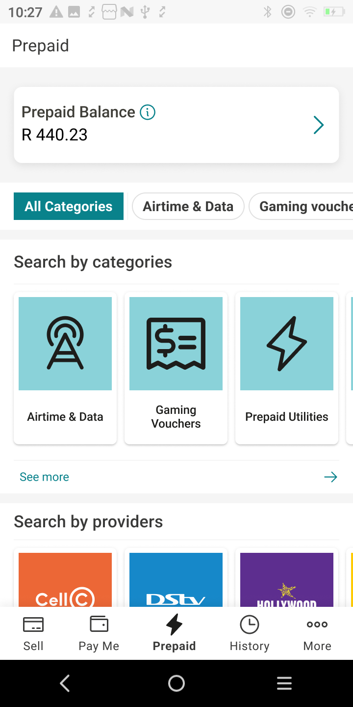
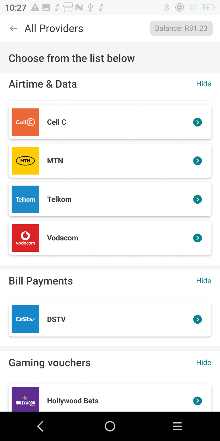
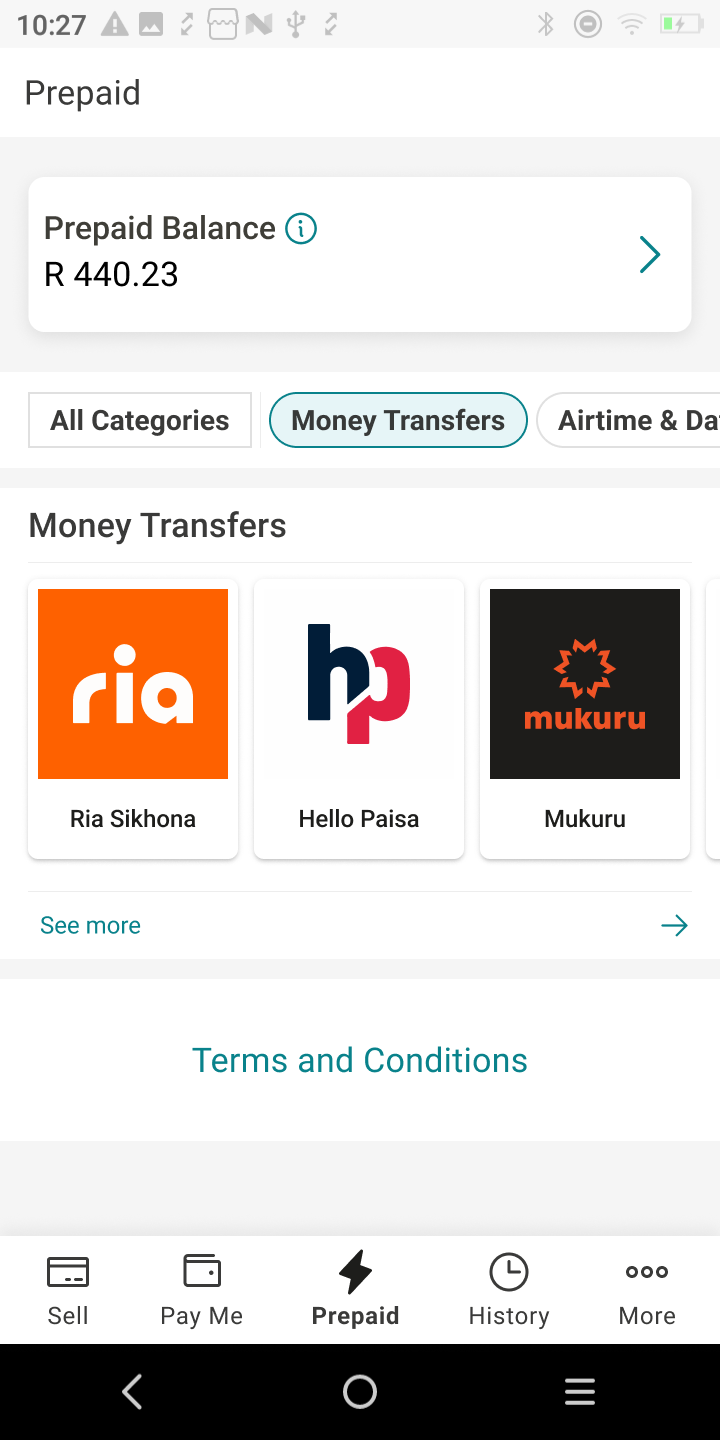
- Hard to find providers
- Too many steps to buy
- No quick repeat purchase
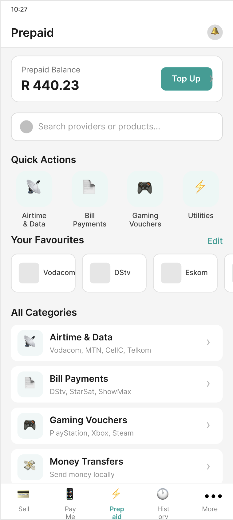
Claude turned that context into low-fidelity wireframes — a starting point in minutes, not days.
Context is everything.
Generic prompts give generic output. So we built guardrails — structured files that teach Claude how iKhokha designs. The quality jumped immediately.
Full index of iKhokha components, tokens & usage rules.
Generates low-fidelity wireframes from flow descriptions.
describe("flow") → render(wireframe)
Hierarchy, component pairing, card treatment & spacing.
Continuously evolving — every new flow sharpens the guardrails.
Closing the gap.
Each iteration brought better context — not just for the AI, but for how our users experience the product.
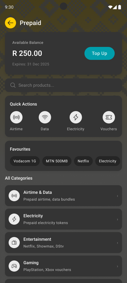
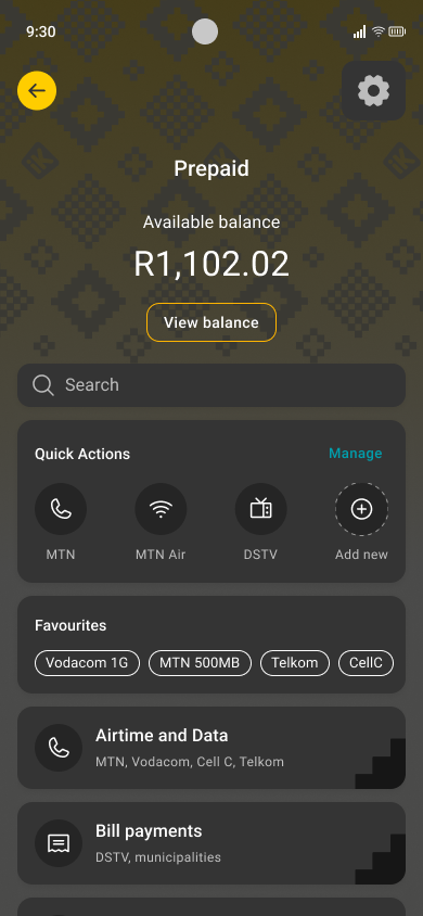
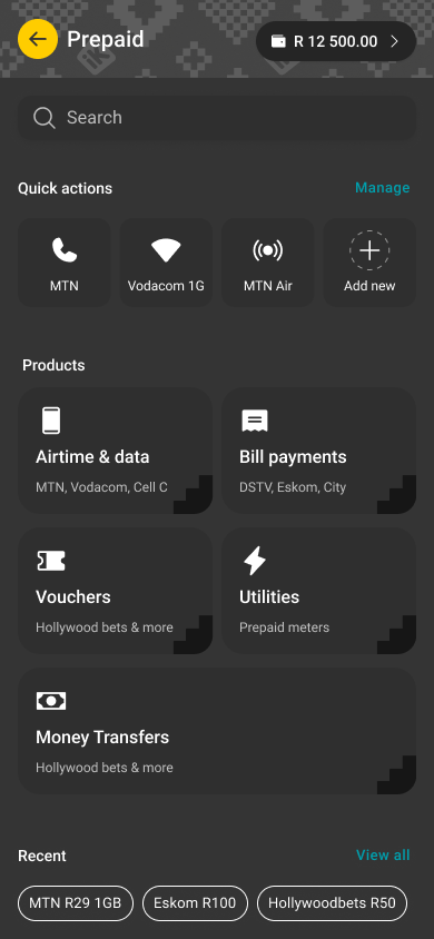
- Better information hierarchy
- More contextual AI prompts
- Closer to production quality
Three things stuck.
AI does 70%. You finish the rest.
AI handles structure, layout and the first pass — you bring the final 30%. Sometimes that means opening Figma yourself for a tweak or two. That’s the collaboration.
Humans still validate.
Documents and guidelines get you far, but humans are still the best way to gather context beyond what’s written — and to judge whether the output is on track.
Start small.
Don’t ask AI to build everything at once. Start with one screen, see how it does, iterate. Smaller scope, faster feedback, better results.
From foundation to default.
-
Phase 1 · Now You are here
Foundation
Setting up skills, learning what works, generating Prepaid screens. Building the baseline for AI-assisted design.
In progress -
Phase 2 · Next
Scale
Bring other teams in. Define AI principles and governance not tied to one tool. Upskill design and product.
Coming up -
Phase 3 · Vision
Enablement
AI becomes the default. Designers and PMs spin up ideas in hours. Exploration is cheap. Shipping is fast.
The goal
Early days. Big signal.
AI has a clear place in how we design.
The optimal workflow — we’re still finding it.
The results are promising.